
Garage Door SEO vs Google Ads: Which Is Better?
Every garage door company owner eventually asks the same question: should I put my marketing budget into SEO, into Google […]
An electrician’s website often gets treated as something you set up once and forget about, the same way you might hang a sign outside your shop and never look at it again.…
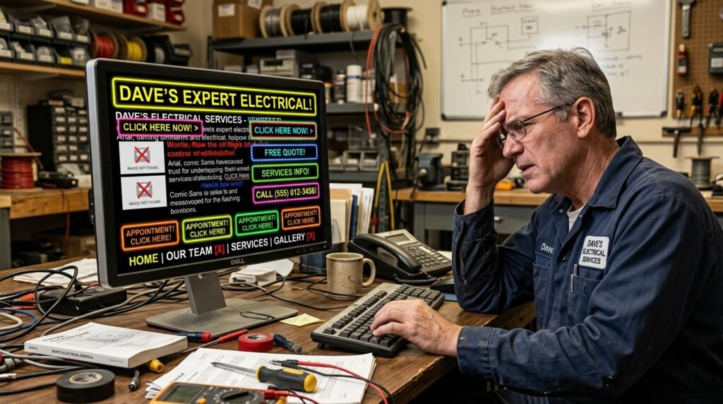
An electrician’s website often gets treated as something you set up once and forget about, the same way you might hang a sign outside your shop and never look at it again. But unlike a sign, your website is working, or failing to work, every single day, often without you realizing it. Someone searches for an electrician, lands on your site, and within a few seconds decides whether to call you or hit the back button and try the next result.
A lot of electrical contractors are losing leads not because their work isn’t good enough, but because their website is quietly pushing potential customers away before they ever get the chance to prove it. Here are the mistakes doing the most damage, and what to do instead.
This sounds almost too simple to matter, but it’s one of the most common issues on electrician websites. If someone has to hunt for your phone number, or if it’s just plain text that doesn’t automatically dial when tapped on a phone, you’ve added friction at the exact moment someone was ready to call you.
Your phone number should be visible in the header of every single page, and it should be a clickable link on mobile devices so a tap connects the call immediately. This is especially critical for electricians, since a large share of your traffic is likely coming from people dealing with an urgent issue, searching from their phone, wanting to reach someone fast.
If your website takes more than a few seconds to load, you’re likely losing a meaningful chunk of visitors before the page even finishes appearing. Someone dealing with a tripped breaker or a flickering light isn’t going to sit and wait. They’ll hit back and call the next electrician in the search results instead.
Large, uncompressed images are usually the biggest culprit. Outdated hosting or bloated website builders can also slow things down significantly. Running your site through a free tool like Google’s PageSpeed Insights will show you exactly where the slowdown is coming from, and it’s often a fixable issue rather than something requiring a full rebuild.
Plenty of electrician websites technically “work” on mobile in the sense that the page loads, but the experience is clearly built for a desktop screen first. Text that’s too small to read without zooming, buttons placed too close together to tap accurately, or a layout that requires constant horizontal scrolling all send the same message to a visitor: this business hasn’t kept up.
Since most local searches for electricians happen on a phone, your mobile experience isn’t a secondary consideration. For a large share of your visitors, it’s the only experience they’ll ever have with your site.
A surprising number of electrician websites make visitors dig around just to figure out what areas they serve or what kind of work they actually do. If someone can’t quickly confirm you work in their town, or that you handle the specific issue they’re dealing with, they won’t stick around trying to piece it together.
List your service areas clearly, ideally with dedicated pages for each major town or neighborhood you serve. Do the same for your services: panel upgrades, rewiring, lighting installation, EV charger installation, and so on. Clarity here does double duty, helping visitors confirm you’re the right fit and helping your site rank for more specific local searches.
A website filled entirely with generic stock photos of unrelated electricians in unrelated uniforms sends a subtle but real signal that this might not be a genuine, established local business. Real photos, your actual team, your actual vehicles, real jobs you’ve completed, build a level of trust stock photography simply can’t replicate.
You don’t need professional photography for this to work. Clear, well-lit phone photos of real jobs and real team members will do more for visitor trust than polished stock imagery that could belong to any electrician anywhere.
Even if your Google Business Profile is packed with great reviews, many visitors won’t think to check it separately if your website itself shows no social proof at all. A dedicated section featuring a handful of strong reviews, ideally with the customer’s first name and general location, reassures a hesitant visitor that real people have trusted you and had a good experience.
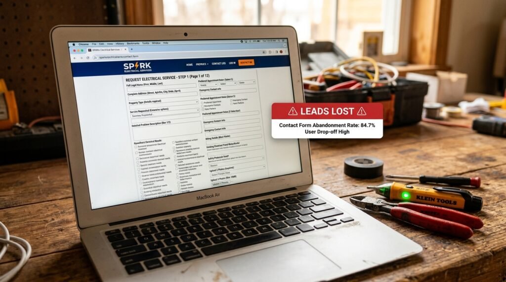
Some electrician websites ask for far more information than necessary before someone can even send a message: full address, detailed project description, preferred callback windows, and more, all before the visitor has had a chance to decide whether they trust you yet. Every additional field is another small reason for someone to give up and leave.
Keep your primary contact form short: name, phone number, a brief description of the issue, and that’s usually enough to get the conversation started. You can gather more detailed information once you’re actually speaking with them.
It sounds obvious, but plenty of websites simply describe the business without ever clearly telling the visitor what to do next. Every page on your site should have an obvious next step, whether that’s “Call Now,” “Request a Free Estimate,” or “Schedule Service Today.” Don’t assume visitors will figure out what to do on their own. Tell them directly, and make that action easy to complete in one or two clicks.

A website that clearly hasn’t been touched in years, whether that’s outdated design trends, broken links, or an old copyright date sitting in the footer, quietly suggests to visitors that the business itself might not be very active either. This is often an unfair impression for a busy, thriving electrical contractor to be stuck with, but it’s a real one, and it costs leads before a visitor has even gotten far enough to learn otherwise.
Most of these mistakes aren’t expensive to fix, and none of them require rebuilding your entire website from scratch. A clickable phone number, a faster load time, a genuinely mobile-friendly layout, real photos, visible reviews, and a shorter contact form can be addressed individually without a massive redesign project. What matters is recognizing that your website isn’t a static brochure sitting quietly in the background. It’s actively deciding, every single day, whether a potential customer picks up the phone and calls you, or quietly moves on to the next name in their search results.
Keep reading
 Blog
Blog Every garage door company owner eventually asks the same question: should I put my marketing budget into SEO, into Google […]
 Blog
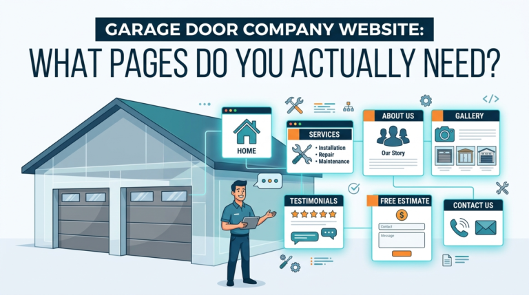
Blog A lot of garage door companies build a website with a homepage, a services page, and a contact page — […]
 Blog
Blog SEO takes months to pay off. Google Ads can start ringing your phone today. For garage door companies, where a […]
Marketing
Reviews, local SEO and a website that is easy to use work best together. Tell us about the business and we’ll tell you, plainly, what we would do next.